
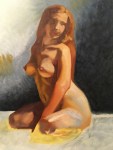
Warning: Mature Content. Images in this post contain renderings of nude models. The soul purpose of these artworks are for discussing and displaying my progress in the art field.
Figure painting (not to be confused with finger painting) using oil paints sounds fun but there were plenty of lessons I had to learn. The first, to learn how to “draw” with my paints. It isn’t the most natural switch to go from sketching with nupastel or conte crayons (which are my usual go-to’s) to using a brush to put down an under drawing. The other was the size of “pencil” or brush. Start big and go smaller as you move on to details. This required having many more brushes on hand than I was used to. Even when just doing a value study.
My gear for this course consisted of oil paints, brushes, linseed oil, mineral spirits, canvases (18×24 preferably), & a model. We would meet for 5 hours a week usually working on one to two poses a session.
Oil Paint Color List:
- Titanium White
- Ivory Black
- Thalo Blue
- Utramarine Blue
- Dioxazine Purple
- Alizarin Crimson
- Cadmium Red Light
- Yellow Ochre
- Cadmium Yellow
- Naples Yellow
- Burnt Sienna
- Raw Umber
- Burnt Umber
Paint Brush Sizes & Shapes:
- 16 Flat
- 8 Hog Bristle Filbert
- 6 Filbert
- 4 Filbert (2)
- 2 Filbert
- 4 Bright
- 2 Short Flat Bright
I used canvas panels due to the fact I rode the bus to and from school and needed to be able to carry multiple panels around even if wet.
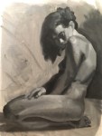
Our first few assignments were value studies only. Focus was spent making sure we had proper proportions and lighting. We were to pay close attention to how the light points got darker as the distance increased from the light source. So even if the legs were lit they weren’t as bright as the face. We also were only allowed to use the bigger brushes at first. This really helped keep me from trying to do the details too early. It really sucks when you render out a beautiful face and pull back to realize it is too small for the body. Time to smear the paint out and start over. That hour and a half was just practice time anyways. Muffled sobs in the distance.
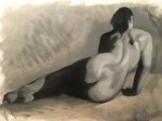
As we moved through the semester our teacher gave us an assignment where we were to use black, white, and burnt sienna. The point here was to introduce color and open our eyes to why using a generic “skin” color doesn’t work. Different areas of the body are going to be more red, yellow, or blue depending on the undertones of what is happening.

Once I discovered how horrible leather people look it was time to move on to more realistic skin coloring. Limiting your palette is a great way to not confuse yourself while painting and it makes it easier to remember how you mixed your colors when needing to match them to existing paint on your canvas.
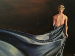
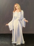
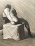
While I feel my paintings went backwards in skill the more I introduced colors I feel my progress is still evident. We also did fabric studies of light and dark fabrics. Fabric is an important aspect of figure painting as many people are painted with clothing. Strange I know but that’s how people want it.
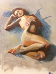
Backgrounds are an integral part to any painting and as such it is useful to always incorporate foreground/model skin colors. If you want the person or object to feel like it is a part of its surroundings the fastest way you can do this is by taking colors from the subject and mix them into the background and colors from the background into the subject. My final was missing this important aspect and as such she just doesn’t read as a part of the scene as much as she could have had I included more colors between the two.

Understanding color value is also a huge area to study when doing figure painting. You have to know that blues are going to read as dark even in the highlights. Reds even when vibrant are usually mid-tones.
Thanks for taking the time to read this post. Leave me a comment below about your favorite piece.
emsilay4
