
Who doesn’t want to just pick up a new medium and create perfection. Good thing my teacher made me work with single colors first. Often times I pick up a new medium and jump in with both feet. Who needs to test the waters first? I’ve got this!
I’d be lying if I said I had never used Nu-pastels before now but I’ve never used more than one color at a time so when I was told I would be doing life sized realistic multi colored head rendering using just Nu-pastel I may have freaked out a bit. Color isn’t my strong suit and every time I’ve tried making skin look like skin I’ve ended up making horribly sick individuals. I’m going to get this down one day so why not get in a few of my 10,000 expert skin painting hours?
Painting? Did she just say painting? Yes I did. Before my current art class Head Rendering I wouldn’t have known Nu-pastel despite being a dry chalk in essence is often referred to as a painting. While I could go search the web just to make myself sound more educated I’m just going to leave it at that.
So let’s see some pictures already!
Ok, as a disclosure I didn’t take a picture of my subject because he was uncomfortable having his real face posted to the web. I chose to honor his request. Would you recognize the guy if you saw him in real life? I wish. My drawing skills would be top notch if I could achieve those levels.
So medium: Nu-pastel. Medium to hard no soft ones yet. I went out and purchased individual sticks for my class to ensure I had a nice palette of skin colors to work with. It’s always smart to minimize your color palette and slowly expand as your understanding of colors grows. I’ve jumped into this post near the end of this course so forgive me for not easing you into the subject better. I’m working on cool toned paper in a large 18×24 toned sketch wire-bound journal by Strathmore.
Colors featured in this assignment are all Prismacolor brand with some no longer having the color label so I’ve also posted their assigned number.
- 248-p

- 208-p Sap Green
- 405-p Blue Haze
- 205-p Peacock Blue
- 206-p Carmine Madder
- 316-p
- 286-p
- 222-p Burnt Orange
- 363-p Garnet
- 298-p Bottle Green
- 304-p
- 207-p
- 243-p Light Ochre
- 235-p Light Blue
- Light Napthal Yellow
- 211-p White
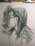
 I like to start out with an under sketch. Some students do this with a medium they are more comfortable with such as pencils/graphite but like I said earlier I’m an all feet canon ball type of artist. Nu Pastel it is. I like to use my darkest color. This helps me decide if the shadows are going to be warm or cool. This is the point you fix your drawing errors. If something is off fix it now or forever hate it. Notice that big forehead? Yeah a tilted board on your lap can really mess up your perspective as you draw so getting up and stepping back a bit as you go will help you notice these mistakes. At this point I’m not afraid of laying down marks since I can cover them up later but there is something to say about being patient and putting down lines that matter instead of just rushing the drawing. Another thing to notice is the length of time you’re looking at your model versus your paper. I’m still studying my subject so any time I feel I haven’t looked up often enough I remind myself to not get caught up in the details.
 Now to add some colors. I like to put down base colors and then build them where I see them. While working with pastels I noticed any color added on top of other colors does two things. It blends and picks up. So notice where you’re using it you might accidentally grab some darks and place them smack dab over a highlight. I like to move around while I work. This keeps my piece consistent while stopping me from focusing too early on details I’ll end up covering up anyways.
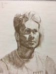
This is the long and tedious part for me. Really look at your subject and see the color changes. The yellow forehead, red nose and blush in the cheeks, the blue under tone in the jaw because of his beard. Don’t let the neck become as bright as the forehead if the light source is above the subject. Light dims as the target is further away.
 Notice the most vivid/intense colors follow the form where light begins to turn to shadow. Highlights are going to bleach out color while shadows are going to reduce visibility so it makes sense the mid tones will contain your most vivid colors. Did you notice the bangs slowly moving down the forehead? This is one of those learning points where you get to hate your mistake because it makes you kill time fixing instead of perfecting. At this point I like to increase my darks as well as add some highlights. I don’t like using black because I feel it isn’t realistic enough. Instead I’ll add a colors complimentary so with my dark Garnet I used Bottle Green (Red/Green) to make a more muddy shadow diluting any vivid shadow areas. I also chose to leave the eyes with some of the paper showing through since it was a nice tone and color temperature so why color over it with the same thing?
 Another last minute pointer is my lack of blending with any object other than the pastel stick itself. In the past when I use only one color I love to blend like a mad women but I’ve noticed with multiple colors I like to leave the color sitting on the paper more. This makes blending easier as I add a new color but at the cost of leaving more of the original paper visible. It creates a harder texture so blending can make the texture seem softer or smoother. Depends on your end desired result really.
 To wrap up this study I put in his shirt and went around cleaning up areas and lines. Total time was close to an hour and a half give 20 minutes. There is something to be said about paying attention to background which I sadly left out of this study. In the end he was a little on the yellow side but we’re all learning right?


As always leave me a comment if you liked this post or want to add something about the subject.
emsilay4
